Still lives in the studio (part 1)- Fine art
So, several of my modules at college and at uni so far have been studio based. Hmm... in fact, there have been 3 in total. All of which have involved an exploration of some of the different categories of studio photographing, including fine art still life.
Right then, let's start at the beginning.
This is the first still life I shot by myself (although I did get in a little bit of a pickle trying to back light it with the textured back which didn't work at all but that is a long story. Basically I ended up lighting the whole thing from above with a single soft box). It's loosely based around the life cycle of a flower and I mean very loosely. This is not the best planned shoot I've ever done and I didn't think about making sure I had flowers of the same type at different stages of the life cycle until the morning of the shoot. So in an attempt to have some kind of consistency through out the image, I chose flowers that were all the same colour. I shot on digital and 5x4 black and white film.
This was also the first time I used a 5x4 camera on my own. I found it quite daunting, it seemed so much bigger and more fragile that the camera's I had used before, and was worried to whole time I was going to break it! Fortunately everything went ok and I processed the film myself in the darkroom. For speed (as I had already started my final piece by the time I had developed the negative) instead of printing an image in the darkroom, I scanned the negative and edited it on the computer using photoshop and lightroom. Given the issues I had at the start of the shoot with lighting (and also with the composition- that started out a real mess!) I'd say the final image is a success. My tutors seemed to think so too as they chose it to be exhibited at a local art gallery at the end of the year (which I have already posted about). I also put it in the portfolio that I took to my university interviews.
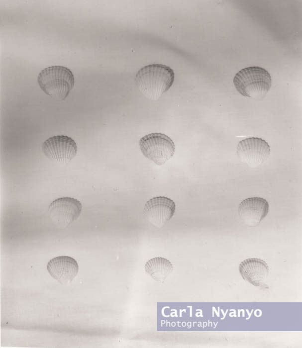
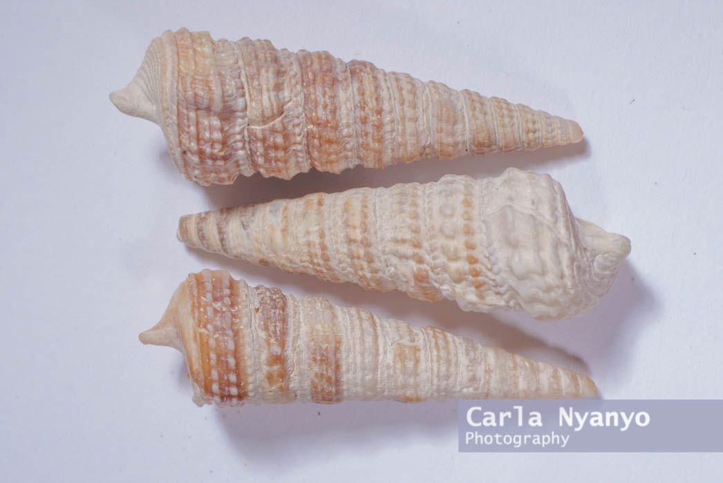
The next shoot I did for the second studio module I felt confident enough to not need to shoot on digital first and went straight for 5x4.
I shot 2 sheets of film, 1 that I developed for the recommended time and a 2nd that I over developed in an attempt to maximise the contrast in the image. I also shot a similar composition on a white background.
The white background definitely works better with these shells as there isn't much variation between the tones of the background and those of the subject. Therefore, the subtle variations that there are, are more easily captured (or something like that anyway).
Both times I developed and printed the images myself in the darkroom. It was all very exciting (I got to use the big enlarger!).
This is a shoot I did using a digital camera with the college's macro lens. I had all kinds of problems on this shoot mainly with the lens and the lighting. The lens was not the best quality and had focusing issues. There was no manual focus setting and a lot of time was wasted trying to get it to focus automatically. And the lighting.... phew! Nightmare! I wanted it to be even and I tried every kind of combination of lights I could think of and nothing seemed to work. I couldn't use a single light above because this is where the camera was and I couldn't find a position for it that didn't cause some kind of a shadow. So then I figured that I could use 2 lights, 1 on the left and 1 on the right, that were the same power and this would eliminate harsh shadows. Which they did but surely if the power is equal there should be no shadow......? I don't know and in the end I just went with it. Looking back now, having the shadows probably isn't such a bad thing as they just add form and depth to the image.
This shoot was really a technical exercise in how to successfully back light a background. I planned this shoot on medium format 6x6 black and white film but because this was a lighting technique that I hadn't had much success with before I decided to shoot on digital as well, just to make sure I was doing it right.
Admittedly, this is not the best copy of this photograph. In fact, it's quite awful. I don't have an appropriate scanner at home and I didn't make a full size print in the darkroom. So I scanned this from a contact print. To be honest, I'm not too sure about this photo. I had wanted to frame it much closer so that the 4 sides of the frame would be touching the globe. Unfortunately, my globe is too small and the lens I was using couldn't focus that close to it. I settled for composing it in the middle of the frame but I think maybe I should have put it in the bottom 1/3
This is from a shoot I did at uni with another student (shout out to Nikki Bowen!). Our task was to create a copy of a traditional still life painting, digitally and on medium format colour film. We chose a painting by Jean Baptiste Simeon Chardin. It was quite a challenge getting the props and lighting as close to the painting as possible. We really had to look at where the shadows fell to determine the correct positioning of the lights and as for the props, we trawled the charity shops of Hereford looking for as close as we could get!
This is the medium format version. It's safe to say that we had some compositional issues. We were set up on a small desk so there wasn't huge amount of allowance either side or below (the bottom of the the frame is literally the bottom of the desk!) We also had problems with the scanner. Even though we picked the correct film format (6x6) it seemed to not be able to tell where each negative was on the strip. Basically, I think that using film was good as it has a much more painterly feel to it however, our execution could have been better. I personally feel that we should have used a 645 or 6x7 format, unfortunately 6x6 was what was available to us at the time.
The final still life is an independent shoot I did at uni called "my breakfast"
Now, I know what you're thinking. "This is what she eats for breakfast!?". Why yes, yes it is. Trust me, weetabix with margarine spread on top is delicious and everybody should try it!
Personally, I think I could have refined this idea further. I was tight for time in the studio as I was sharing my slot with Nikki and we had limited lighting available because there was another group working at the same time as us. I ended up only being able to light the background from one side and over exposing it by about 2 stops (I would have liked to make it a bit brighter but I didn't want to loose too much depth of field, which I fear I have slightly). I also now see that my shutter speed was too fast and didn't sync properly with the flash, which is the black line running down the left of the image.
Overall, this isn't the worst photograph I've ever taken but it's certainly not the best. I like my concept (nice and simple!) but like I said, I think a little more time and perhaps another shoot after a period of reflection would have resulted in much improvement.
And now I realise I've rambled quite a lot in this post. I do hope you made it to the end!


